Motorsport live results
In 2015, I wrote a site for HS Sports to display live race information for their motorsport events. This site is built using Drupal 7 using a Bootstrap theme.
Race administration and updates
This site has a custom REST API to receive results from timing systems on the ground. The information on this site changes frequently during a race; we aim to present the user with updated data every 5-10 seconds.
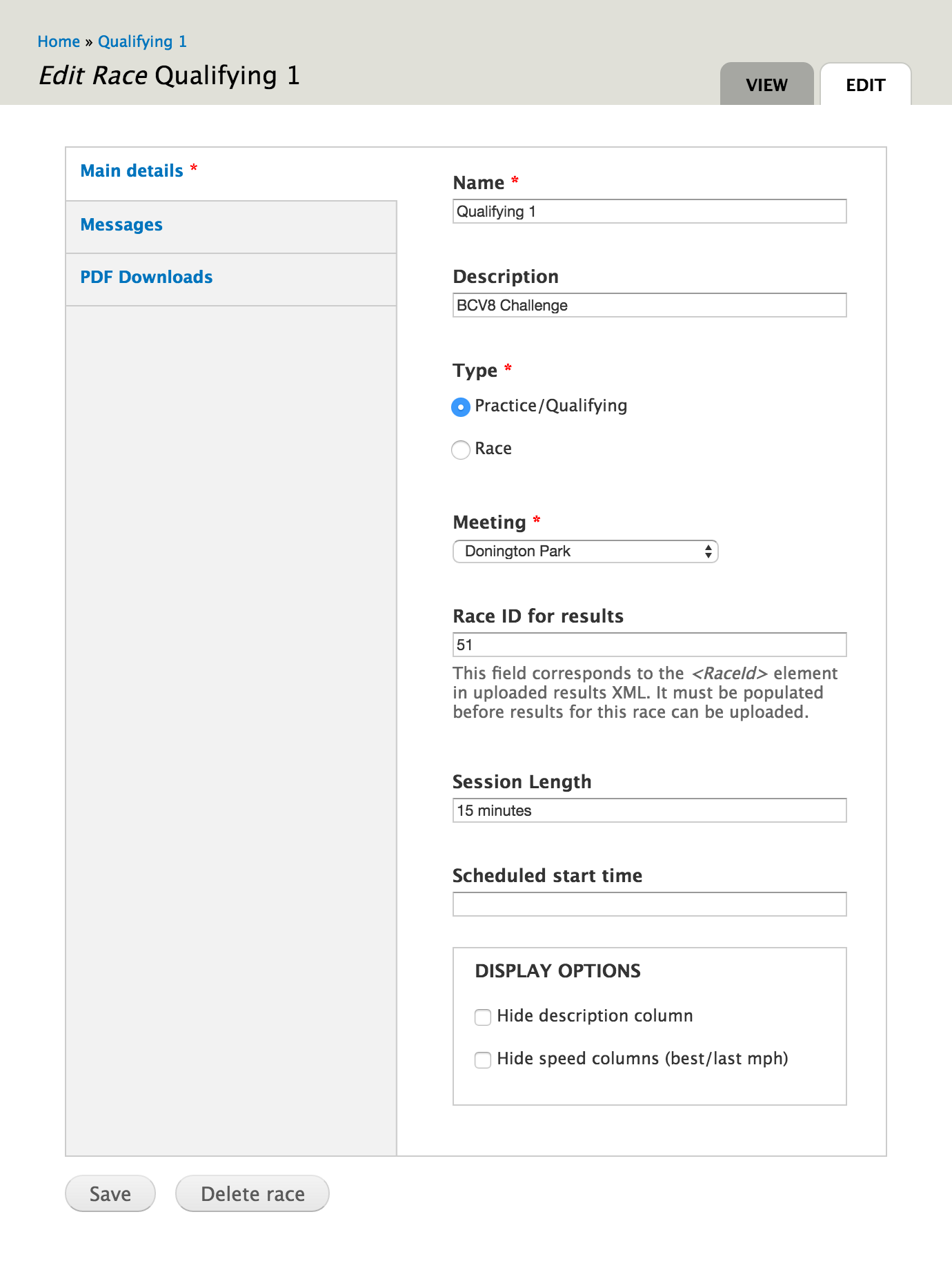
Race details can also be changed directly on the site. A race is a high pressured (and noisy!) environment, so the administrative elements of the site have been designed to be as simple and quick to use as possible. With a few small changes, Drupal’s content editing form works well for this.
Results display
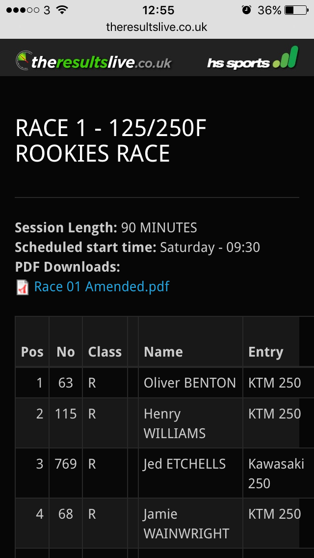
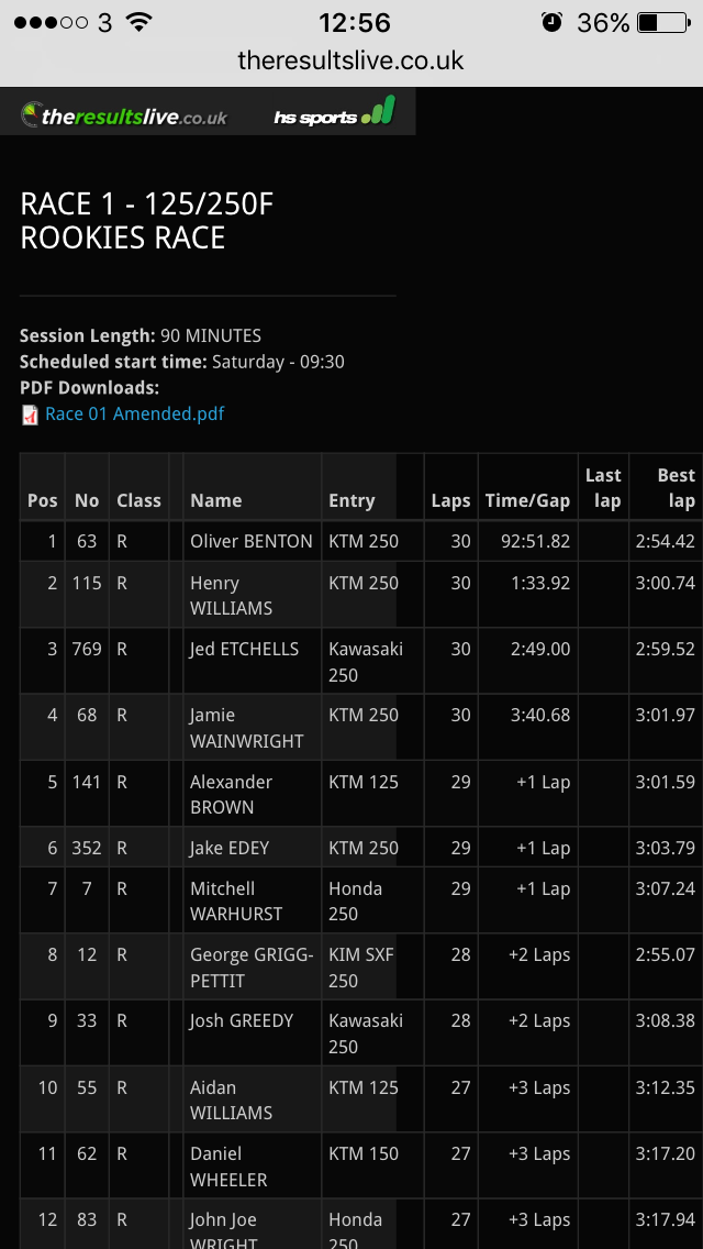
The information on this site is accessed by people at the events, typically on mobile phones. The results tables are both wide and long, so we needed a suitable way to display that.
All the content within the tables is relevant, so hiding columns isn’t an option. Neither is reducing the default font size, there’s just too much detail to squeeze it in.
There are a few options for showing a large table on a small screen. The same would apply to an infographic:
-
Hide certain columns.
This doesn't really work here. Firstly, all the columns contain relevant information. Secondly, we don't want to make assumptions about how people use different devices. What matters is the context, not the device.
-
Reduce the font size.
At first this might seem viable if you have a small number of columns to squeeze in. But it makes assumptions about the size of the viewport that we don't want to make.
-
Put the table inside a scrollable container.
This allows you to view all content at an appropriate font size, and does keep the rest of the page the same when scrolling up or down beyond the table. However you lose the ability to zoom out, seeing a larger area at a smaller font size. It also becomes more difficult to tell which rows are which, especially as the leftmost column is often an identifier of some sort.
-
Do nothing; let the table grow beyond the initial viewport width.
Ultimately you don't really gain anything from the above techniques, so for this site we have left the font size and viewport width alone. If you want to see more of the data at a smaller font size, just zoom out. If you don't, and need to scroll, then panning the browser viewport will do just that.